|
CONVERSION GUIDE The Anatomy of a High Converting Landing PageDesign & Copy Secrets Backed by Data By TechnoGaze Solutions Private Limited | 11 key elements | Practical checklist inside |
Your Landing Page Needs Seconds to Make a Difference
Suppose you have clicked on an ad offering a digital marketing service. The service is good and the terms interesting. However, the website does not have an eye catching headline, it has too much text, its banner does not load fast and the contact form requires providing ten different things from you.
How will you react? In all probability, you will close the window.
Compare this to another scenario. Your page has loaded quickly, its headline describes your problem accurately, you know what benefits you get and you even know what you need to do.
|
These two examples are the difference between just a good looking landing page and an effective conversion machine. |
If you spend money on SEO, Google Ads, social media marketing or email marketing, then this difference becomes really important, because every single click is an opportunity to gain a customer, but a page that fails to generate the needed trust and interest will let you down.
This knowledge of how design, copywriting and user experience affect conversions is very valuable for TechnoGaze Solutions Private Limited. So what actually makes a landing page effective? Let us dissect its elements, discuss some facts and learn how to convert more visitors into leads and clients.
|
53% mobile visits can be lost if a page takes more than 3 seconds to load (Google, historical figure) |
5th–7th grade reading level pages showed better conversion in an Unbounce SaaS analysis |
6% conversion rate when 60 of 1,000 visitors fill the form |
What Is a Landing Page and Why It Matters?
A landing page is a specialized page on the internet aimed at getting the visitor to perform a certain action. This action could be asking for a quotation, making an appointment, downloading a guide, signing up for a webinar or making a purchase.
Unlike the usual web page where visitors have various options for navigation, a targeted landing page pushes them toward one specific action.
Thus, if a digital marketing agency runs a Google Ads campaign for businesses searching for SEO services in Bhopal, sending the traffic to a general homepage may force visitors to find their desired service by themselves.
A landing page, on the other hand, will give visitors an explanation of the SEO service offered, information about its benefits, answers to common questions and a way to ask for a consultation.
The visitor does not have to make an effort to know what to do next. The page tells the visitor what to do next.
01Grab Visitors’ Attention Right from the Start
The headline of your page is usually the first thing visitors see. Therefore, it must make sure that visitors are interested enough to explore your page further.
Three questions your headline must answer
- ● What is it that you are offering?
- ● To whom do you want to offer it?
- ● Why would your visitors be interested?
Weak vs strong headline
|
✗ WEAK HEADLINE “Welcome to our digital marketing services.” |
✓ STRONG HEADLINE “Generate qualified leads using a digital marketing strategy tailored to your business needs.” |
The difference is significant, because when a person visits a page, he or she is usually interested in solutions rather than in the range of services offered by a particular company.
Headline writing tips
- ● Find out the main problem that interests your audience.
- ● Connect your offer to a specific benefit.
- ● For a software company, the headline could be about saving time. For a real estate firm, it could mention property selection. For an advertising agency, it could mention qualified leads, campaign performance or improved visibility.
- ● Keep the headline aligned with the ad, email or search result that brought the visitor. If the message changes, visitors doubt themselves and probably bounce.
|
PRO TIP: Write several headlines (three to five of them) and test them for performance rather than basing your decision solely on personal preference. |
02The Hero Section: Convey Your Value
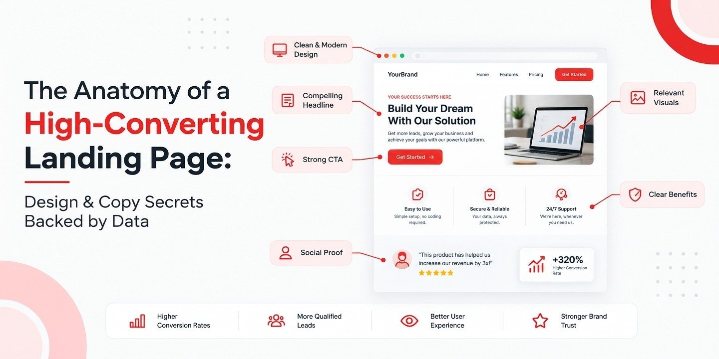
The hero section is the first big section visitors encounter on arrival. It consists of the headline, copy, image and a call to action button. Imagine it as your virtual first impression. A good hero section conveys the offer without forcing visitors to think.
Example: web development services landing page
- ● Headline: Create a Website that Works for Your Business.
- ● Supporting text: Learn about responsive websites that will enable your business to communicate effectively and deliver a better online experience.
- ● CTA: Let’s Talk About Your Website Project.
- ● Visual: A website mockup of the project showing the design on desktop and mobile devices.
It is obvious that all the components convey one message. There are no distractors preventing the visitor from comprehending the offer.
Secrets of creating a strong hero section
- ● Apply visual hierarchy. The headline should catch attention, supporting text should be readable and the CTA button recognizable.
- ● Select relevant images that give more information about your product or service, rather than decorating your site with irrelevant stock images.
- ● Avoid clutter. No competing information, multiple offers or distracting animations.
- ● Do not tell everything to everyone at once. The point is to help people understand enough to proceed with their action.
03Copywriting: Sell the Benefit, Not the Feature
The most professionally designed landing page can still be ineffective if it doesn’t resonate with its audience through the copy. Focusing too much on the feature set of an offer is one common pitfall.
|
✗ FEATURE BASED “Our agency delivers SEO services, PPC campaign creation, social media management and website development.” |
✓ BENEFIT BASED “Develop your online presence using our services tailored for increasing discoverability, engagement and lead generation.” |
The first version tells what services you provide but fails to connect with visitors in terms of their needs. The second links the services with business goals without making any promises.
Problem – Solution – Benefit approach
A simple copywriting template that helps structure your copy:
- ● Problem: State the problem your audience is familiar with. “Your website gets visitors but leads don’t come on a regular basis.”
- ● Solution: Explain how your service can help solve it. “Increase your leads by improving the messaging, design and lead generation flow on your landing pages.”
- ● Benefit: Show the outcome. “Make the process of finding your company and then reaching out to your team as clear for potential customers as possible.”
Keep the language simple
According to Unbounce, there is an association between landing page readability and conversion rates. In its analysis of SaaS landing pages, pages written at roughly a fifth to seventh grade level showed better conversion rates than more complicated ones. These findings suggest a correlation rather than a cause and effect relationship. Write as if you were explaining the service to a potential customer face to face.
04Call to Action: Let Visitors Know What to Do Next
A person may find your offer appealing but will not proceed if the next step is unclear. That is why the call to action (CTA) deserves special consideration. A CTA is the button, link or anything else that motivates a visitor to take the desired action.
Some examples:
| Book a Free Consultation Request a Quote Download the Guide Schedule a Demo Get Started Today |
The importance of using the right CTA text
|
BUTTON A Submit |
BUTTON B Request My Consultation |
With Button B, the user understands more clearly what they will get once they click. Base your CTA text on the actual offer or action you want users to take and the level of commitment required. The visitor may not be ready to buy, so actions such as a consultation, a demo or a valuable resource may be more appropriate.
Make the button easy to find
- ● Ensure enough color contrast between the CTA text and its background.
- ● Keep the button well separated from other elements so it easily catches the eye.
- ● If the page is long, place the CTA near the headline and repeat it at strategic places further down.
05Forms: Request Information You Actually Need
Each new field on a form takes the user’s time and asks for more data. When a business needs leads for consultation, it might require a name, email and some information about the request. Asking for a postal address, business turnover, several phone numbers and more in the very first step can be counterproductive.
How to design a user friendly form
First, understand the information your sales or support team really needs. For a simple inquiry, these fields are enough:
- ● Name
- ● Business email or phone number
- ● Required service
You can always add more information later. Use appropriate labels, explain any uncommon requirements and show informative error messages that don’t delete everything the visitor has already filled in.
And don’t forget to explain what happens next. Text like “Our team will contact you regarding your inquiry” does the trick, provided it matches your workflow.
|
TIP: Test a shortened version of your form against the existing one. Compare not only the number of submissions but also their lead quality. |
06Trust Signals: Give People Reasons to Trust You
Visitors may not be able to evaluate your service beforehand. They may be unsure whether your firm is legitimate, whether you offer the right service and whether their information will be in safe hands. Trust signals answer these questions.
Include these, based on what you can validate
- ● Testimonials from your real customers
- ● Case studies that feature relevant results
- ● Client logos, used with permission
- ● Professional certifications
- ● Verified reviews
- ● Contact information
- ● Pricing or service information
- ● A privacy policy statement explaining how inquiry data will be processed
For instance, a digital marketing agency might publish a case study showing the client’s starting problem, the strategy followed and the result achieved in a defined period. A case study is far more convincing than simply saying “We provide the best results.”
|
⚠ Important: Do not fabricate testimonials, business connections, awards or performance metrics. Deceptive evidence can undermine credibility rather than build it. |
07Visual Design: Eliminate Distractions and Enhance Comprehensibility
Effective landing page design does not mean cluttering the page with visual elements. It means making the essential ones easy to understand. A user should be able to scan the page and see the offer, its advantages, the proof and the next action.
Follow these design recommendations
- ● Utilize whitespace effectively. Space between headings, paragraphs, images and buttons makes content easier to scan.
- ● Pick legible typography. Use clear fonts, reasonable font sizes and adequate text/background contrast.
- ● Build an effective visual hierarchy. Headings should guide users naturally from the core promise to the supporting points.
- ● Use relevant imagery. Screenshots of products or services and real pictures of projects help convey abstract advantages.
- ● Eliminate distractions. Too many pop ups, auto playing audio, animations and unnecessary navigation pull the user away from the goal.
- ● Think accessibility. Add alternative text on images that carry relevant information, keep keyboard focus visible and make sure text is readable against the background.
An elegant design is great, but usability is indispensable. Make the design facilitate the decision, not fight it.
08Mobile User Experience and Page Speed: Don’t Lose Visitors Before They Start
Think about a user who clicks your Instagram ad while traveling. The landing page loads, but the text is not readable, the button is too small and the form doesn’t fit the screen. However interesting your offer is, it loses its effect on such users. Mobile optimization must be part of the plan from the very beginning.
What does the research say?
According to Google’s mobile web page guidance, 53% of mobile site visits can be lost if a website takes more than 3 seconds to load. This is a popular historical figure, not a forecast of the abandonment rate of all modern websites. The practical takeaway stays the same: a slow page creates friction, especially when people arrive from a mobile campaign.
Ways to optimize mobile performance
- ● Use compression and choose proper image file types.
- ● Avoid oversized videos and animations.
- ● Use fewer unnecessary scripts and third party components.
- ● Design a responsive layout.
- ● Make buttons big enough to tap easily.
- ● Build a form that is easy to fill out from a mobile device.
Test loading speed and usability with Google PageSpeed Insights. Keep in mind that speed is not the whole story: even the fastest website with complicated text will not perform well, while an effective site that is slow will not stand a chance either.
09A/B Testing: Let Real Users Help You Make the Right Decisions
Should your headline be longer or shorter? Will the CTA result in more inquiries? Will a video or a product image perform better? You can make assumptions, but testing lets you see how your audience actually reacts. A/B testing compares two versions of your page or a component, keeping other factors constant as much as possible.
|
VERSION A “Grow Your Business Using Digital Marketing” |
VERSION B “Reach More Potential Customers with Targeted Digital Marketing” |
Both headlines communicate a benefit, but they emphasise different ideas. Testing helps determine which message generates more qualified enquiries.
Where to start first?
Start by testing elements that can influence users’ decisions:
- ● Headline and the message supporting it
- ● CTA copy and position
- ● Form length and number of fields
- ● Hero section design and visual components
- ● Testimonials and trust signals
- ● Mobile design and page performance
|
REMEMBER: Don’t rely on click through rate as the only success metric. A CTA that attracts more clicks but generates fewer leads might be the inferior one. |
10Measure What Matters: Key Metrics of Landing Pages
A landing page should be evaluated by whether it achieves its business goal, not just by how good it looks or how much traffic it draws. Use analytics and conversion tracking to understand how visitors behave on the page.
| Metric | What it tells you |
| Conversion rate | The percentage of visitors who complete the intended action |
| Bounce or engagement metrics | Whether visitors leave quickly or interact with the page, depending on the analytics definition |
| Form completion rate | How many visitors who start a form successfully submit it |
| Cost per lead | How much you spend to generate a lead |
| Lead quality | Whether enquiries match your target audience and sales requirements |
| Page load performance | How quickly the page becomes usable |
| Return on ad spend (ROAS) | Revenue attributed to advertising relative to advertising spend, where reliably measurable |
How to calculate conversion rate
|
Conversion rate = (Number of conversions ÷ Number of visitors) × 100 |
If 1,000 visitors land on a landing page and 60 fill out the inquiry form, the conversion rate is 6%. The formula is helpful, but context is crucial: decide which type of conversion you are measuring and apply the same metric every time.
If a page generates 100 leads and only two qualify as potential customers, boosting the number of form fills won’t necessarily fix the problem. You have to attract the right users and give them an opportunity to take meaningful actions.
11The Key Elements of a High Converting Landing Page Checklist
Before launching your next landing page, check the following list:
- ✓ The headline clearly conveys the relevant benefit.
- ✓ The hero block outlines the offer instantly.
- ✓ The copy solves a particular problem.
- ✓ The CTA prompts a particular action.
- ✓ The form requires essential information only.
- ✓ The trust elements are legitimate and verifiable.
- ✓ The design is clear and accessible.
- ✓ The page is fully mobile friendly.
- ✓ Images and scripts are optimized for better performance.
- ✓ Analytics and conversion tracking are set up appropriately.
- ✓ The page is consistent with the messaging of the campaign driving the traffic.
- ✓ A strategy has been developed for reviewing results and testing changes.
You don’t have to redesign everything all at once. Begin with the major barrier to conversion, make an appropriate change and evaluate the effect.
Conclusion: Create Your Landing Pages around People, Not Just Pixels
A high converting landing page will not be determined by a clever headline, nice colors or a well placed button alone. It is a combination of several key factors.
- ● The headline grabs the visitor’s attention.
- ● The hero section explains the offer.
- ● The copy resonates with the visitor’s needs.
- ● The design makes the information easy to understand.
- ● The trust factors remove doubts.
- ● The CTA offers the next step.
Marketing research can give you many ideas on how to proceed, but the behavior of your particular audience will be your best source of feedback.
Recognizing that successful businesses need an effective online presence, TechnoGaze Solutions Private Limited understands the significance of combining creativity, communication and specific goals when it comes to landing pages. Only then does a landing page become much more than just another place for visitors to land.
|
Look at one landing page of your website right now. Do you see what offer is made? Do you see what the next step should be for visitors? Do you find it easy for them to trust you and do what you want them to do? Sometimes the best thing you can do is not to add something new, but to get rid of whatever prevents visitors from taking action. |
SP
Written by
Sadhana Patidar
Senior SEO Executive, TechnoGaze Solutions
Sadhana Patidar is a Senior SEO Executive at Technogaze Solutions with more than five years of experience in technical, on-page, off-page and local campaigns. She holds expertise in optimizing websites to increase visibility, correcting any technical problems and driving organic traffic through data-informed methodologies. Sadhana is passionate about realistic SEO strategies that produce ongoing results, after combining data elements with practical tactics of optimization. Her expertise includes detailed audits, optimizing content, blog writing and website content writing, developing link-building campaigns that boost online presence. Passionate about learning and development, Sadhana actively looks for current search engine optimization trends to ensure each engagement is reflective of the best search engine optimizations and competes well across digital platforms.